Public data · Free · No account · Live now

USDataSo

The data said so.

A free tool for exploring America's public data — census demographics, health outcomes, environmental burden, elections, jobs, businesses, and broadcast media — down to the census tract. No account. No paywall. No proprietary data.

It's a demonstration of two things at once: how much public and open data is genuinely available today, and what one person can build with it using AI-assisted development.

Open USDataSo →Why we built it
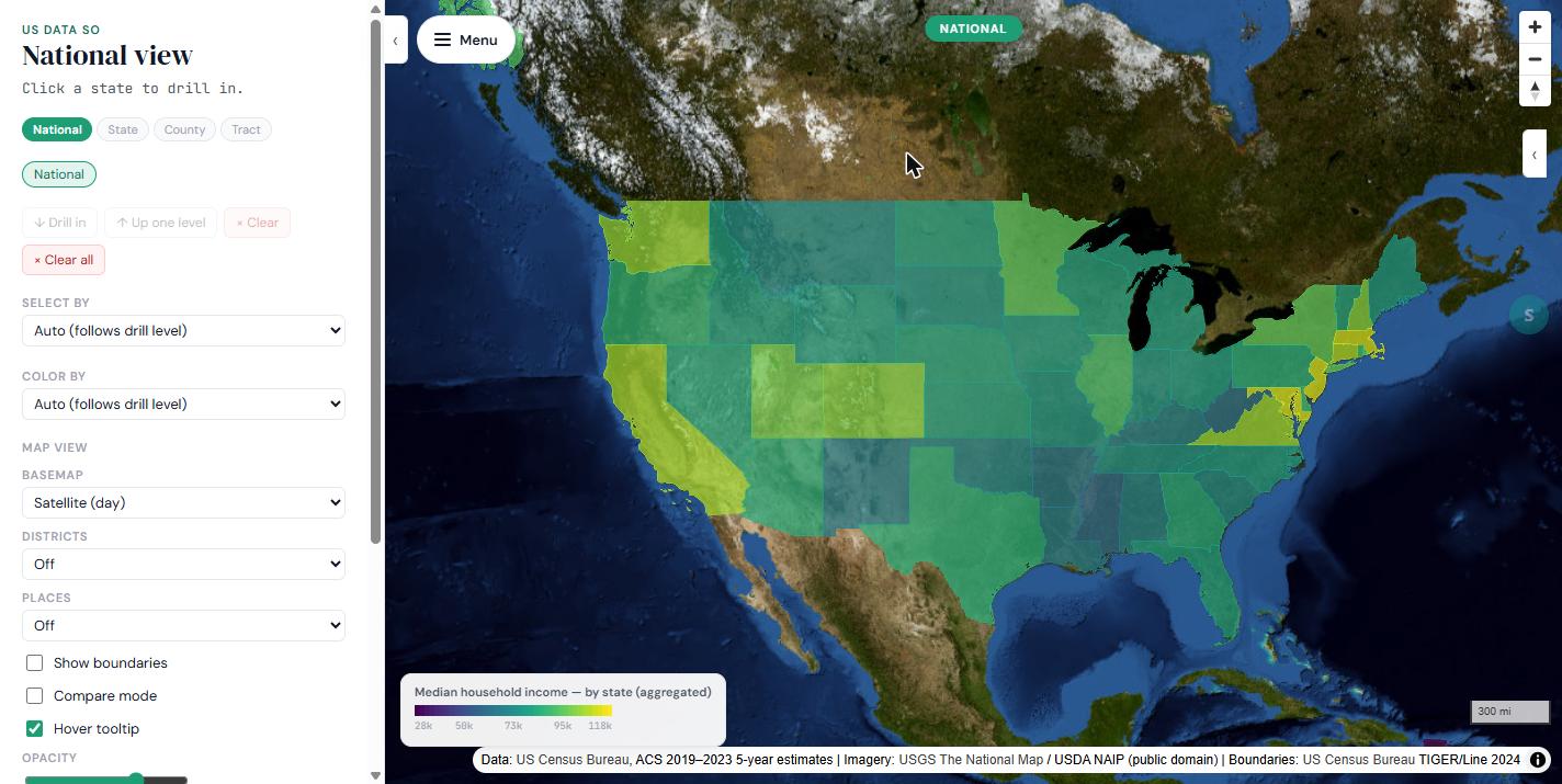
The USDataSo national view: a satellite basemap of the United States with every state shaded by median household income, a legend in the corner, and the left panel showing National / State / County / Tract drill levels and Select By, Color By, and basemap controls.
118
Live indicators, every one with its source
85,000+
Census tracts — finer than zip code, finer than city
~130k
Lines of code, written in partnership with AI
~$5/mo
Hosting cost, on a paid Cloudflare edge tier

What it is

Public data, finally usable

The U.S. government — and a growing set of open-data contributors alongside it — publishes an enormous amount of information about how the country actually lives: who lives where, how healthy they are, what they earn, how they vote, which doctors serve their community, who owns the radio station down the street. Nearly all of it is free and public. Almost none of it is easy to actually use.

Every layer on this map — the census tracts, the health outcomes, the election results, the businesses, the providers, the broadcast stations — comes from a real government or open-data source with no paywall and no proprietary licensing standing between you and it. And the platform itself, all of it, was built in partnership with AI rather than by a large team over years.

USDataSo is part of the SaidSo family of products, each built around the idea of a verifiable record — what was actually said, shown, or measured. Where .dealis about agreements ("they said so"), USDataSo is about public data: the data said so. Every number on the map carries its source, so you can always see where a figure came from and what it does and doesn't mean.

What you can do

  • Drill from a national view into any of five geography levels — State, County, City, Congressional District, and Census Tract
  • Layer multiple data types on the same map — income over health outcomes over environmental burden
  • Compare two or more places side by side
  • Search for a business chain, healthcare provider, or radio/TV station and see where it operates
  • Ask a plain-language question about a place and get an answer grounded in the actual data, not a guess
  • Toggle between raw counts and per-capita rates

Why we built this

It started with a doodle

Why is data that belongs to everyone so hard for everyone to use?

There's a version of this project that would have taken a team of ten people two years to build. Instead, it took one person, a few weeks, and roughly 130,000 lines of code — most of it written not by hand, but in partnership with AI.

That's The Doodle Principle in action: the belief that AI becomes most powerful when paired with human curiosity, creativity, and judgment. You supply the spark. AI supplies the scaffolding. Together, you build things neither could create alone.

The federal government collects extraordinary information about where people live, how healthy they are, what they earn, what they breathe, how they vote, and which doctors serve their community — the Census Bureau, the CDC, the EPA, CMS, Congress, agency after agency, dataset after dataset, all of it funded by taxpayers, almost none of it accessible to a curious person without a GIS license and months of patience. That gap felt like a problem worth doodling at.

Open at every layer

USDataSo runs on openness at every layer of the stack, because the data deserves it and because the tools to do it right finally exist.

The data is free.

The core draws from government-origin sources — Census ACS, CDC PLACES, AHRQ SDOH, EPA EJScreen — produced with public money and never meant to sit behind a paywall.

The data is expanding.

The platform is growing beyond government sources into the open data tier — data that originates outside government but is freely contributed. Overture Maps Places, backed by a foundation with Amazon, Meta, Microsoft, and TomTom among its contributors, is already live. The full licensing picture is below.

The technology is open.

MapLibre GL JS, PostGIS, Cloudflare's edge infrastructure, D3.js — open source or open standard, chosen deliberately so the architecture itself can be understood, audited, and replicated. No proprietary lock-in.

Six lenses on every place in America

USDataSo doesn't show you one thing about a place — it shows you what federal data knows about it, organized around six dimensions of real life.

41 indicators
People

Who lives here, what they earn, how educated and healthy the population is — a demographic portrait at the census tract level, finer than zip code, finer than city.

11 indicators
Environment

What the air is like, what environmental burdens a community carries — EPA EJScreen's pollution exposure and proximity data, layered over every tract.

Congressional record
Government

What Congress is actually doing about the issues facing this place. Each representative's sponsored and co-sponsored bills, policy areas, CRS summaries, and House roll-call positions are pre-ingested — ask the AI panel what your representative has done on healthcare or housing, and it answers from the real record.

22 indicators
Economy

The economic landscape on the ground, plus Overture Maps Places' physical footprint of commerce — how many restaurants, pharmacies, or grocery stores exist in a community, and how that density compares tract to tract.

36 indicators
Medical

Where the doctors are. The NPPES National Provider Identifier registry — CMS's database of every licensed healthcare provider in the country — so you can see provider density by specialty at the census tract level.

8 indicators
Politics

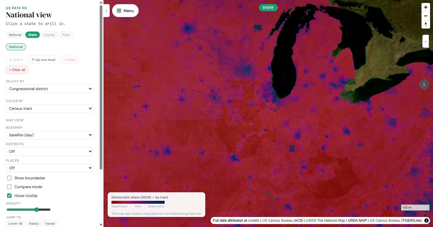
Not the media narrative, not a state-level aggregate — what a specific place actually voted, at precinct level from Redistricting Data Hub in 43 states and county level from MIT Election Lab in the remaining 8. Zoomed all the way in, most of American geography reads as purple, not red or blue.

Indicator counts are read from the live Data panel and move as sources ship. The data categories are adapted from the PESTLE framework analysts use — four of its six domains are carried as live categories; Technological folds into Economy and Legal has no tract-level indicators to carry it.

Michigan's Lower Peninsula with Color By set to Census tract, shaded by 2024 Democratic vote share on a red-to-purple-to-blue scale. Thousands of small tracts show a speckled gradient — purple and blue pockets inside red areas — rather than solid blocks; the legend reads Democratic share (2024) — by tract, created using data from the Redistricting Data Hub.

Politics, zoomed in

Most of the map is purple

A gradient of margins that state-level maps erase. You can set your own thresholds for what counts as red, blue, or purple, and watch the map rearrange around the real data.

What 130,000 lines of code actually means

Without AI as a development partner, that list is a GIS engineer, a backend data engineer, a frontend developer, a cloud infrastructure specialist, and a healthcare-data specialist who understands NPPES — months of coordination between five people. With AI, it was one generalist and a few weeks.

The expertise barrier didn't disappear; it democratized. That's The Doodle Principle running at scale, not hype.

  • Geospatial data pipelines
  • Vector tile generation
  • Census-tract-level spatial joins
  • Multi-source ETL across six-plus federal and open data sources
  • NPI geocoding through the Census Batch Geocoder
  • Congressional bill ingestion feeding a local-corpus AI search
  • Voting-pattern choropleths with user-configurable thresholds
  • AI narrative generation
  • An API with rate limiting and caching
  • Congressional-district crosswalks weighted by block population
  • A full edge deployment for about $5 a month

Enterprise rigor, democratized

There's a misconception that serious, production-grade software needs an enterprise budget and an enterprise team. USDataSo was built the way a professional delivery looks — not because an organization demanded it, but because good habits are how good software gets built: every feature tracked at ticket level in Atlassian Jira, every architectural decision and design record documented in Confluence, a phased roadmap with defined epics, a hybrid AI/human delivery model where AI accelerates the build and human judgment governs the decisions that matter — which sources to trust, which metrics to surface, which edge cases to handle honestly, and which questions the platform should refuse to answer on the public's behalf.

USDataSo isn't just a data explorer. It's a proof of concept: that one person with the right tools, the right framework, and AI as a genuine partner can build what used to require a team.

The data said so. Now you can see it.

Data sources

Which data said so

USDataSo sorts every source into one of two tiers: official government data, published or maintained by a federal agency, and open data, contributed by companies or individuals outside government. We label which is which wherever it matters, because "the data said so" only means something if you can also see which data.

Official government

Sourced directly from a government agency, or curated by a third party in a way that doesn't change where the data originated.

Open data

Sourced from outside government — crowdsourced, corporate-contributed, or independent research. A newer tier, disclosed as such wherever it appears — including in the AI narrative layer's own language.

Official government

Official government data

SourceWhat it coversUpdate cadenceLicense / terms
Census ACS (American Community Survey)Population, income, housing, demographics at tract levelAnnualCensus API Terms of Service — attribution required in the UI; no modification of published values without labeling; tract-level aggregation only, no individual identification.
CDC PLACESHealth outcomes, behaviors, prevention measuresAnnualPublic federal data.
AHRQ SDOH DatabaseSocial determinants — housing, transportation, food access, provider supplyAnnualPublic federal data. AHRQ re-scopes its variable set each year and is not cumulative (the 2023 release dropped 345 variables), so each indicator is pinned to the vintage that actually carries it rather than always pulling "the newest" file.
EPA EJScreen v2.3Environmental burden — PM2.5, ozone, diesel particulate matter, proximity to hazardous sites, drinking water violationsFrozen — no refresh cadenceSourced from a third-party archived mirror, since EPA discontinued the live API in February 2025 with no official replacement. Raw burden indicators only; the composite "EJ Index" equity scores are deliberately excluded — you see the underlying pollution data and combine it with demographic layers yourself, rather than a pre-weighted score.
Redistricting Data Hub2024 election results at precinct level for 43 states — the most granular data available, verified down to the individual census tractOne-time for 2024 cycleRDH's Data License Agreement — non-commercial and non-partisan use only.
MIT Election Data & Science Lab (MEDSL)2024 election results at county level for the remaining 8 jurisdictions — Arkansas, Indiana, Maine, New Jersey, Oklahoma, Oregon, Pennsylvania, and DC. County results are applied uniformly across those tracts.One-time for 2024 cycleSee Data Credits for the current license terms.
Census LEHD LODESWhere people work — employment by sector, by tractAnnual, varies by state (most 2023; Michigan 2021; Alaska 2016, the last year it participated)Public domain.
FCC Licensing and Management System (LMS)Every licensed radio and TV station — location, owner, network affiliationRefreshed monthly in the USDataSo pipeline (the source itself updates daily)Public domain federal filings.
Open data

Open data

SourceWhat it coversUpdate cadenceLicense / terms
Overture Maps PlacesBusiness/establishment density and presence by location and categoryMonthly — the fastest-changing source in the catalogCDLA Permissive v2.0, with one important wrinkle: most records carry CDLA terms, but records contributed by Foursquare (about 9.6% of the extract) are licensed separately under Apache License 2.0, which carries its own attribution and "notice of changes" requirements. USDataSo serves the license text and a NOTICE file for both, rather than a single blanket credit line, because a generic "data sources" credit wouldn't actually satisfy either license.

In the product

The tier travels with the number

USDataSo carries an on-page Open databadge wherever Overture-sourced figures appear, and the open/official distinction is also passed into the AI narrative layer's context, so an AI-generated explanation can caveat accordingly — "official CDC estimates" versus "open establishment data suggests." That's a shipped product decision, not a policy statement.

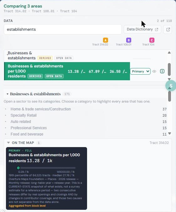
The data panel showing the Businesses & establishments indicators, each tagged with DERIVED and OPEN DATA badges, with the per-1,000-residents version set as the map's primary fill and an On the map card crediting Overture Maps Foundation.
Evaluated, not built

A third bucket — licensed/commercial — sits outside both tiers and is not used in the product. Nielsen DMA boundaries and TomTom/HERE traffic data are in the source catalog for future evaluation, but the current lean is toward exclusion. They are not part of the live product and aren't claimed as available or planned.

Every indicator, its source, governance tier, and methodology: Data Dictionary · every dataset, its license and known limits: Data Credits

How to use it

Eight things the map can do

Written for a first-time visitor. Every screenshot below is a real capture of the live app.

Exploring the map

Start at the national view and drill into any of five independently selectable geography levels — State, County, City, Congressional District, and Census Tract. USDataSo is one of the few free tools that goes all the way down to tract level. Three controls work together:

  • Indicatorwhat you're looking at (income, health outcomes, election results, and so on)
  • Color Bywhat geography level the map's fill color is calculated at
  • Select Bywhat a click resolves to — this controls what the tooltip and detail card describe

Every value on the detail card says how it got there — as reported at this level or aggregated from tract level — so a county figure built from its tracts never looks identical to one the source published directly.

From there, three separate things are possible: layer several data types on the same map (a primary fill plus two extra slots), compare places side by side, or askthe AI panel a question about whatever you've selected. Each is covered below.
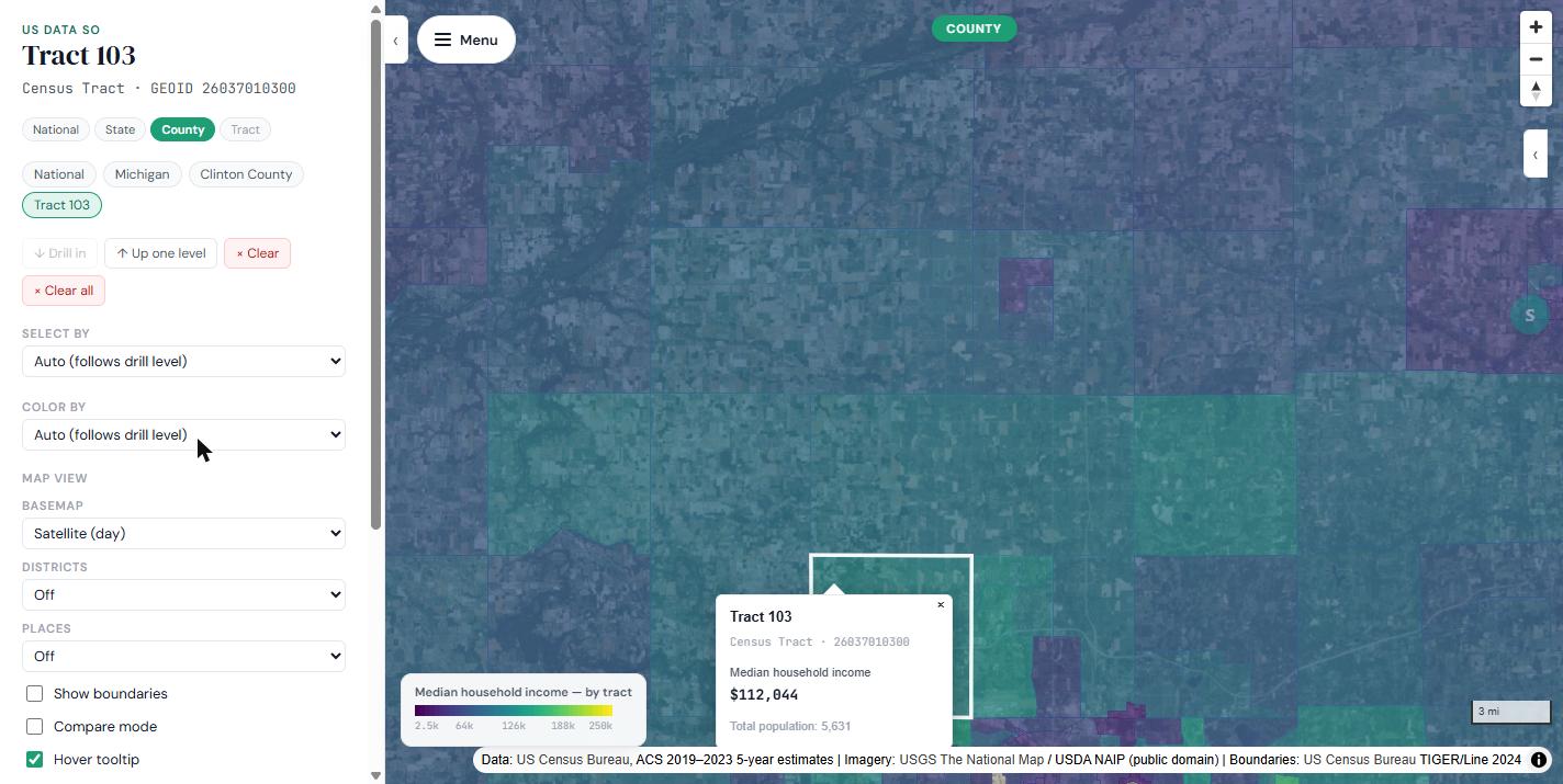
USDataSo map zoomed to Clinton County, Michigan, with census tract 103 selected. The detail card shows median household income $112,044 and total population 5,631; the breadcrumb reads National, Michigan, Clinton County, Tract 103.

Places Explorer

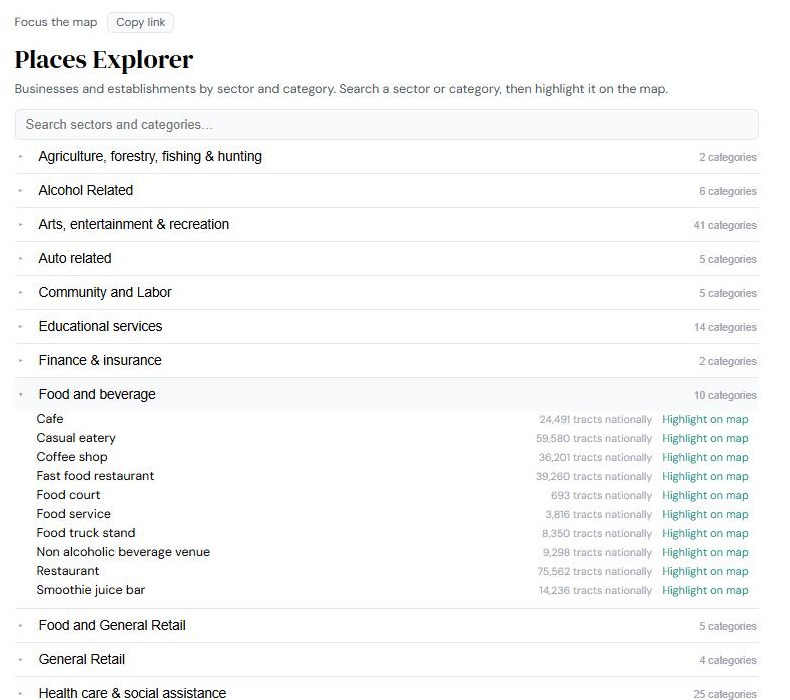
A dedicated view for "what's actually here" — browse everything in a category (say, restaurants, or healthcare providers) within a selected area, drilling from a category summary down to an individual list of places. It opens in its own window and follows whatever the map has selected.

The Places Explorer page listing business sectors such as Arts, entertainment and recreation, Food and beverage, and Health care and social assistance. Food and beverage is expanded to show categories like Cafe, Coffee shop, and Restaurant, each with a count of tracts nationally and a "Highlight on map" link.

Brand Search

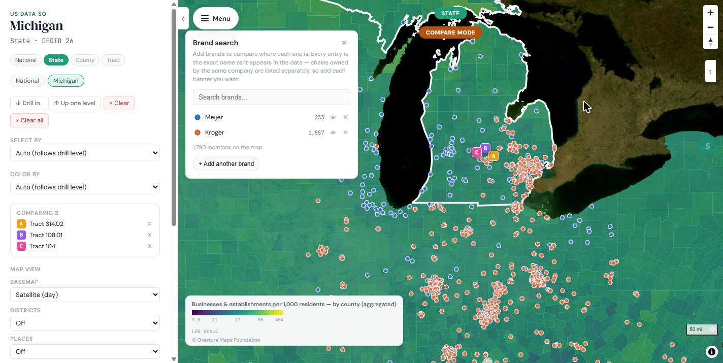
Search for a specific chain or company by name — see everywhere it operates on the map, and compare multiple brands side by side. Useful for corporate-family comparisons, since USDataSo doesn't assume ownership relationships it can't verify from the data — you build the comparison list yourself.

Brand search panel with Meijer (233 locations) and Kroger (1,557 locations) added, and the map of Michigan and surrounding states covered in blue and orange location pins for each chain.

Provider Search

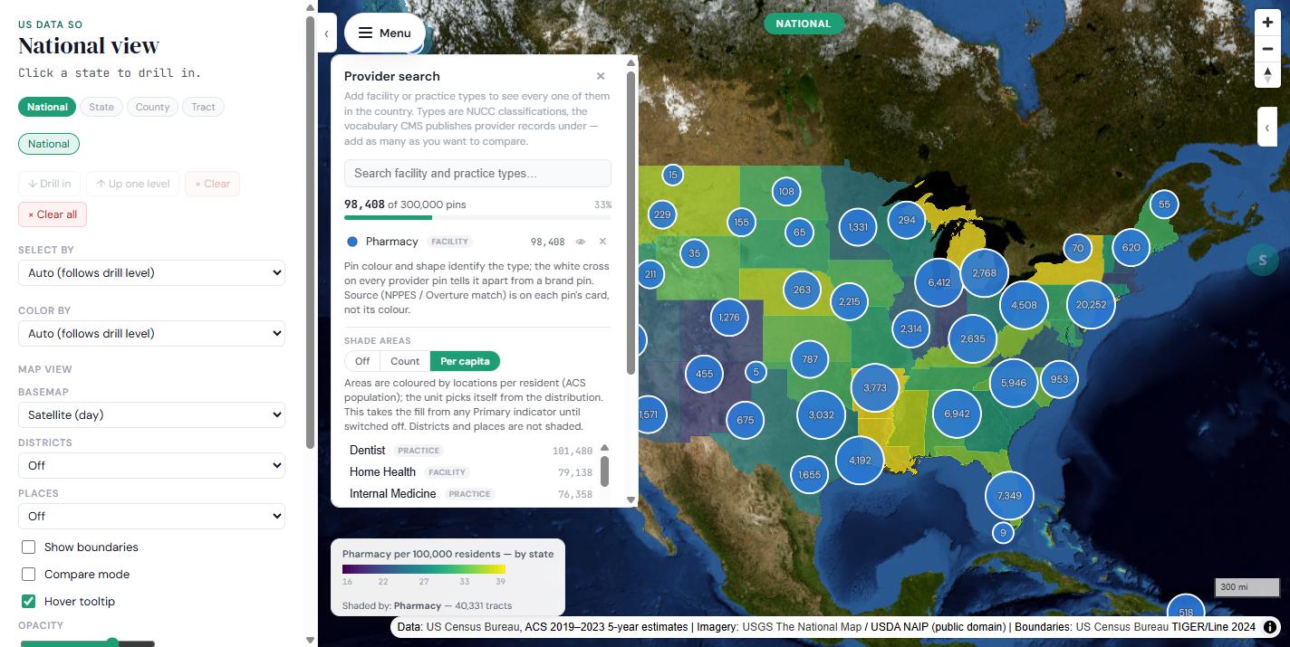
Search healthcare facilities and practices by type — hospitals, clinics, specific specialties — using the same national taxonomy providers are classified under (NUCC classifications, the vocabulary CMS publishes provider records under). Add as many types as you want to compare, and shade the map by count or per capita.

Provider search panel with the Pharmacy facility type added (98,408 pins) and the Shade areas control set to Per capita. The national map is shaded by pharmacies per 100,000 residents by state, with clustered pin counts over each state.

Media Search

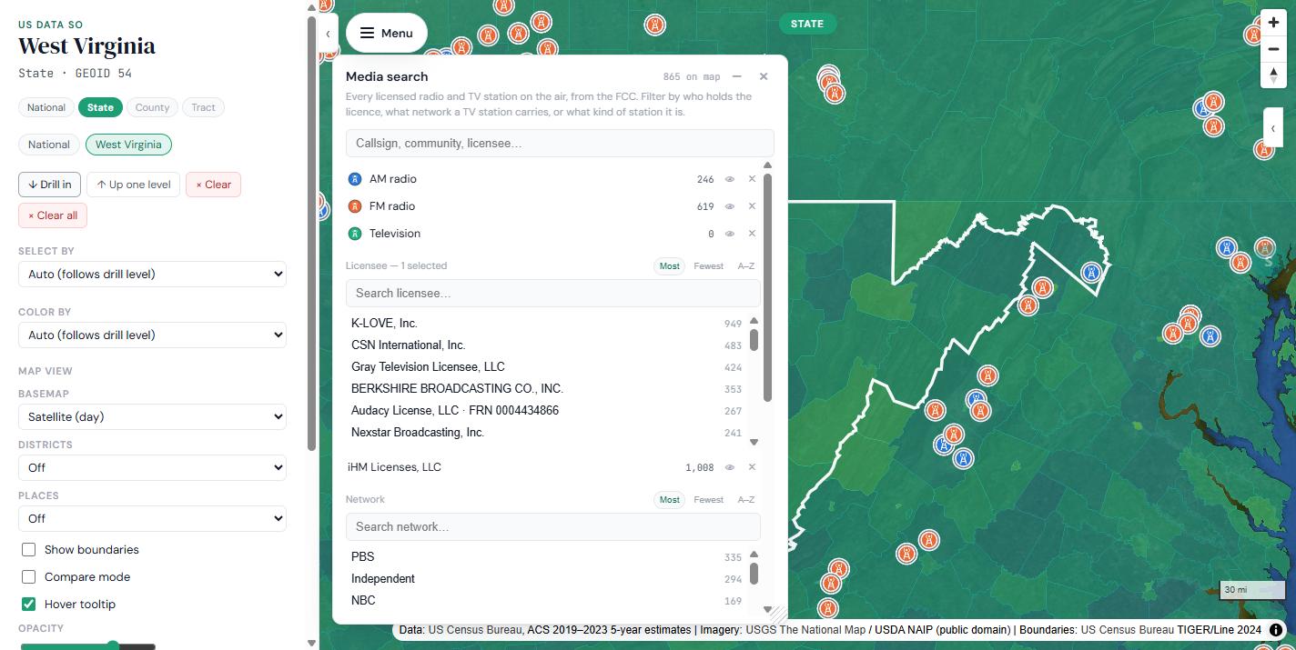
Look up radio and TV stations by owner, network, or location, and see them on the map. Every licensed station on the air, from the FCC. There's also a dedicated station lookup page for direct search by callsign, community, or licensee.

Media search panel filtered to the licensee iHM Licenses, LLC, showing 246 AM and 619 FM stations, with AM and FM station pins scattered across West Virginia and neighboring states on the map.

Compare Mode

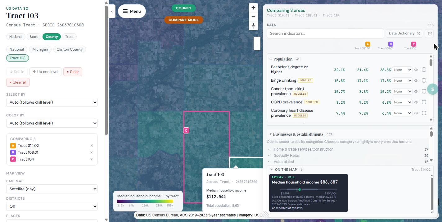
Select multiple places and see their data side by side in one panel — built for exactly the kind of "how does my county compare to the one next door" question the tool exists to answer. Tick Compare mode, click the areas you want, and every indicator in the data panel becomes a column per place.

Compare mode with three Michigan census tracts pinned as A, B, and C on the map, and the data panel headed "Comparing 3 areas" showing indicators like bachelor's degree or higher side by side: 32.1%, 21.4%, 28.5%.

Absolute vs. per-capita

Switch between raw counts and rates per resident wherever it's meaningful. Provider search has an Off / Count / Per capita shade control; business density ships as a matched pair — the count and the same thing per 1,000 residents — so you can compare rates rather than raw totals.

One honest caveat:USDataSo doesn't apply a minimum-population floor to per-capita rates, so a tract with very few residents can show a very high per-capita number. That's a deliberate choice — see the FAQ below — rather than an oversight.

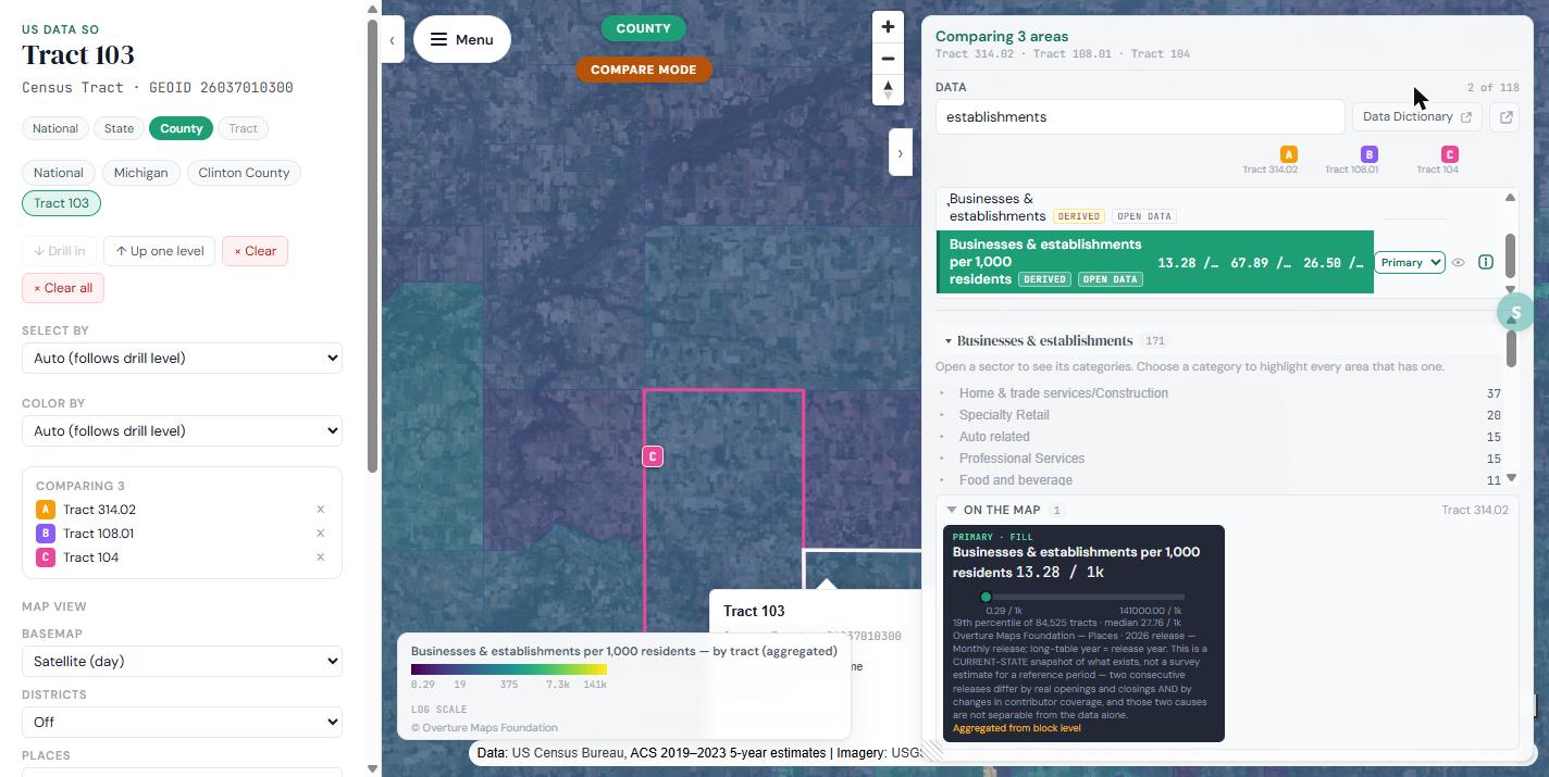
The data panel with "Businesses & establishments per 1,000 residents" set as the primary map fill, directly below the raw "Businesses & establishments" count. Both rows carry DERIVED and OPEN DATA badges. The On the map card cites Overture Maps Foundation and notes the value is aggregated from block level.

Ask AI

A conversational panel that answers plain-language questions about the geography or comparison you've selected — "why is this so different from next door," cross-area similarity ("what other places are like this one"), and questions about what your representative has done on a topic.

It's built so the AI never invents a number: a fixed calculation produces every figure you see, and the AI only explains it in plain language. AI-generated text is visually marked — italic, with an AI Generated label — so you always know which parts are computed and which are narrated. Full detail on how this works, and its limits, lives on the AI policy page.

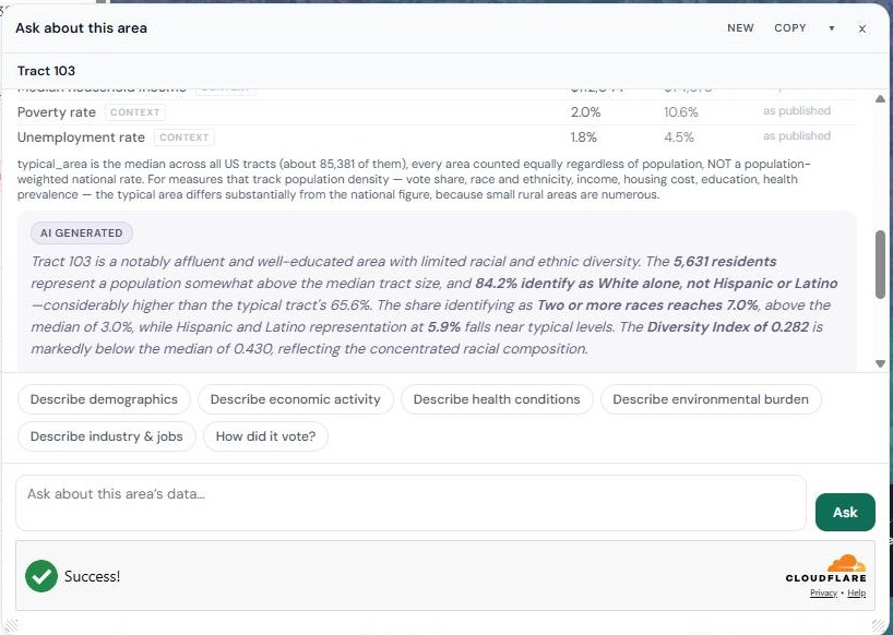
The Ask about this area panel for census tract 103. Above, a plain table of computed values with "as published" provenance labels. Below, a box labeled AI GENERATED containing an italicized narrative describing the tract as affluent and well-educated, with suggested prompts like Describe demographics and How did it vote.

FAQ

Honest answers

Is USDataSo really free?
Yes. No account, no login, no paywall on any core feature. USDataSo only uses public data, so there's no proprietary licensing cost to pass on.
Why do some per-capita numbers look extreme in small areas?
A handful of tracts have very few residents and a real number of businesses or facilities — think an airport, an employment zone, or a similar special-use area rather than a residential neighborhood. When you divide by a very small population, the rate can look dramatic even though it's mathematically accurate. We made a deliberate choice not to hide or suppress these values with a minimum-population floor. If a number looks surprising, click through to the underlying raw count — that's usually enough to see what's going on.
Why is your environmental data from 2024 and not more current?
That layer comes from EPA's EJScreen tool, which EPA discontinued (no live public access) as of February 2025, with no official government replacement published since. We source it from an archived mirror of the last published version (v2.3, August 2024) rather than leave the layer empty, and we say so clearly wherever that data appears. We're watching for a maintained successor and will switch to it if one appears — this is not meant to be a permanently frozen layer.
Why does your election map show more detail in some states than others?
2024 election results come from two sources depending on the state. 43 states show precinct-level results via the Redistricting Data Hub — verified down to the individual census tract. The remaining 8 (Arkansas, Indiana, Maine, New Jersey, Oklahoma, Oregon, Pennsylvania, and DC) show county-level results via MIT's Election Data and Science Lab. It's labeled on the map, and the per-state methodology is on the app's Data Credits page.
What does "aggregated" or "derived" mean on a data point?
Whenever a number is calculated by combining smaller areas — say, showing a county-level figure that's really built from its underlying census tracts — we label it as aggregated rather than presenting it identically to a value published directly by the original source. This applies uniformly across every data source we use.
Can I trust the AI-generated explanations?
The AI never calculates a number — it only explains numbers a fixed, non-AI process already computed. Every figure the AI references is grounded in the same underlying data the map shows, and it's visually marked so you can tell AI-written text from the underlying data at a glance. See the AI policy page for full detail.
Do you sell or share my data?
USDataSo requires no account and stores no personal information to use the core product — there's nothing to sell.

See what the data says about your place

No sign-up, nothing to install. Open the map, click your state, and keep clicking.

Open USDataSo →

usdata.saidso.co